


An infographic is a visual tool that combines data and design to tell a story in a way that’s easy to digest. It’s more than just charts and graphs; it blends information creatively to make complex ideas understandable. Think of it as a visual storyteller that uses elements like colors, shapes, and icons to make data engaging. Infographics are a powerful way to communicate because they simplify and clarify information. Whether explaining a new concept or summarizing a report, infographics can make your message more impactful.
The Importance of Infographics in Communication
Infographics play a crucial role in today’s fast-paced information age. They help break down dense information into bite-sized, visually appealing pieces. This is especially useful in education, marketing, and journalism, where clarity and engagement are key. By using infographics, you can effectively capture attention and convey messages quickly. They are particularly useful for presenting statistics, timelines, and comparisons. In a world where attention spans are shrinking, infographics offer a way to communicate efficiently and memorably.
Common Types of Infographics

Infographics come in various forms, each serving a different purpose. Here are some common types:
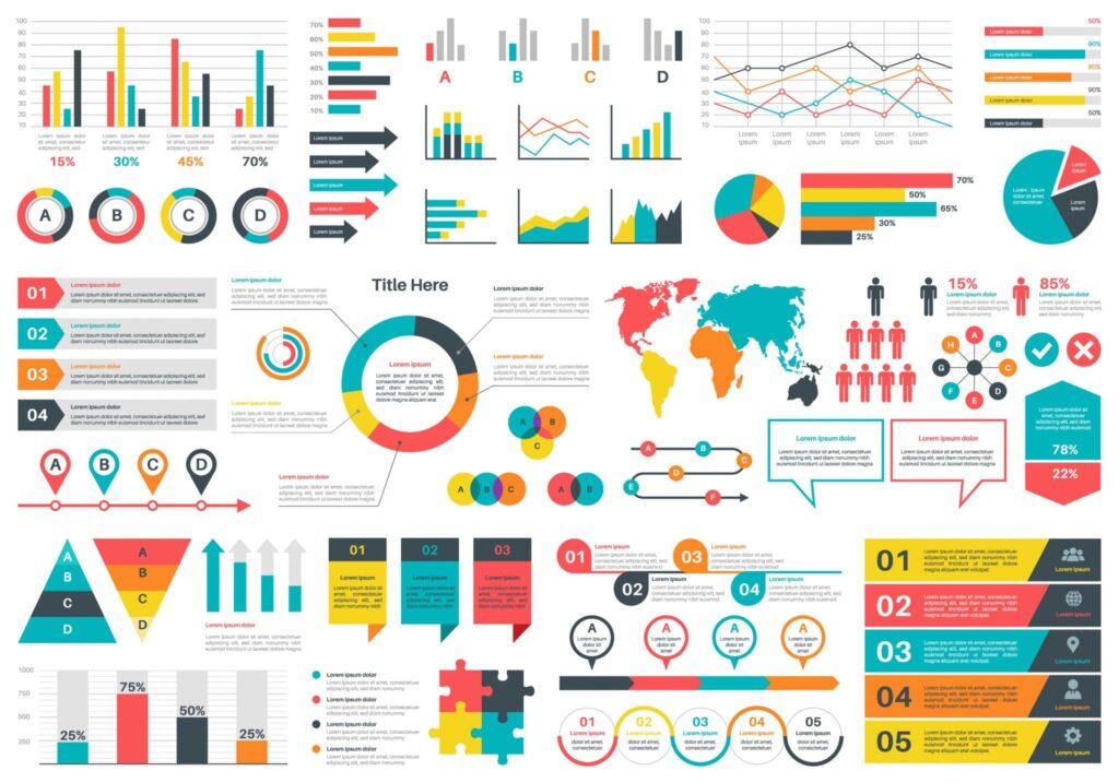
- Statistical Infographics: These focus on presenting data and numbers visually appealingly. They’re perfect for reports and surveys.
- Informational Infographics: These explain a concept or process step-by-step, often using illustrations and minimal text.
- Timeline Infographics: These help show the progression of events over time, ideal for historical data or project timelines.
- Comparison Infographics: These highlight differences and similarities between options, useful for decision-making processes.
Each type of infographic serves a unique function, making it easier to choose the right one based on your communication goals.
Planning Your Infographic Design
Defining Your Infographic Goals
Before you dive into creating your infographic, it’s crucial to pinpoint what you want to achieve. Are you looking to educate, inform, or perhaps persuade your audience? A clear goal will guide every decision, from the data you include to the design elements you choose. After viewing your infographic, consider the action you want your audience to take. This could be anything from signing up for a newsletter to visiting a website. Be clear about your objectives to ensure your infographic hits the mark.
Identifying Your Target Audience
Knowing who you’re speaking to is half the battle. Consider who will be viewing your infographic. Are they novices in the subject, or do they have some expertise? Tailor your content and design to meet their needs and expectations. If your audience is more general, keep your language and visuals clear. You can use more technical language and detailed data for a more specialised audience. Understanding your audience will help you deliver information that is both engaging and relevant.
Choosing the Right Infographic Template
Once you’ve nailed down your goals and audience, it’s time to pick a template that suits your needs. There are countless templates, and choosing the right one can make a big difference. If your infographic is data-heavy, a clean, organized layout will help convey your message without overwhelming your audience. A more creative and visually appealing template might be the way to go for simpler topics. Remember, your chosen template should complement your content, not overshadow it. Play around with different styles until you find one that feels just right.
Gathering and Organizing Your Data
Collecting Relevant Data for Your Infographic
Alright, let’s get into the nitty-gritty of collecting data for your infographic. First off, you need to know what story you’re trying to tell. Without a clear narrative, your data is just a bunch of numbers. Start by deciding whether you will use existing data or collect your own. If you’re going with existing data, there are plenty of repositories to explore. Think U.S. Government’s Open Data for a wide range of topics, or Kaggle for user-uploaded datasets on everything from chocolate bars to startup funding. If you’re up for collecting your data, surveys and research are solid options. Just make sure your questions are clear and objective.
Organizing Data for Visual Representation
Once you’ve got your data, it’s time to whip it into shape. Organizing your data effectively is key to making it understandable. Break it down into sections—quantitative data like numbers and stats should be separate from qualitative data like opinions or descriptions. Use tables if you need to lay out numbers or comparisons. A simple table can make a difference when you’re trying to show trends or differences. And remember, your audience shouldn’t have to work hard to get the point. Please keep it simple, and focus on the main message you want to convey.
Ensuring Data Accuracy and Credibility
Now, let’s talk about making sure your data is legit. Accuracy is everything. Double-check your sources and confirm that the data is up-to-date. If you’re using third-party data, ensure it’s from a reputable source. Credibility matters. If you’re collecting your data, be honest about your methods and any limitations. You don’t want to mislead your audience, even unintentionally. It’s all about trust; once that’s gone, your infographic won’t stand a chance. So, take the time to verify everything before moving forward.
Designing Your Infographic
Selecting the Right Tools and Software
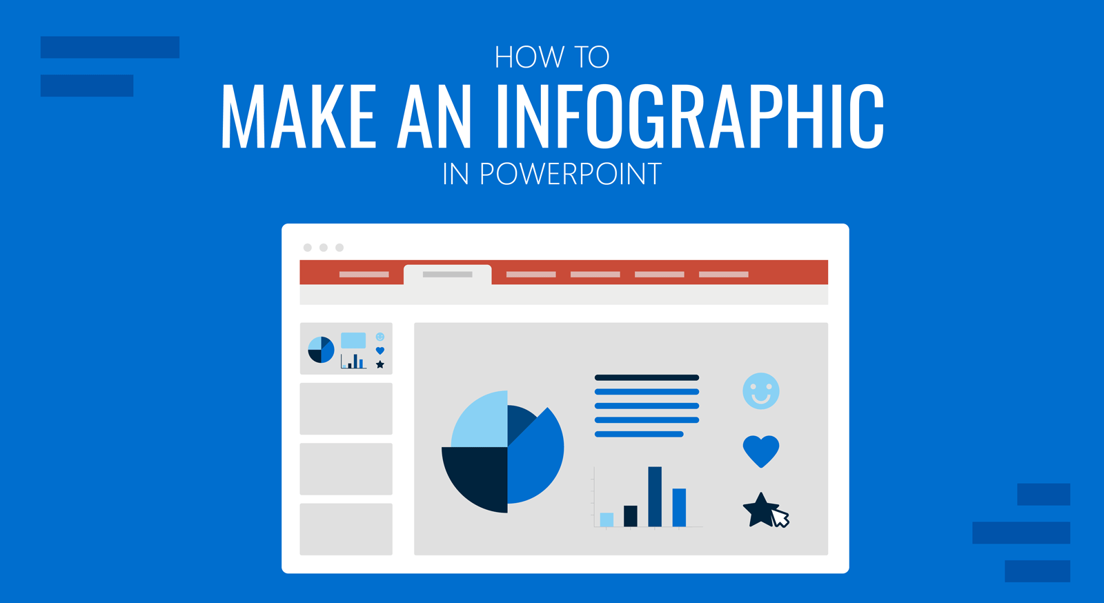
Getting the right tools is like finding the perfect paintbrush for your art. There are tons of software options, from Adobe Illustrator to Canva. If you’re just starting out, Canva is a great choice because it’s user-friendly and offers a lot of templates. Adobe Illustrator provides more flexibility and features for those who are more advanced. Choosing the right tool depends on your comfort level and the complexity of your project.
Incorporating Visual Elements and Graphics
Visual elements are the backbone of any infographic. Start by picking a color palette that resonates with your message. Think about using icons to break up text and highlight key points. Icons are not just decorative; they guide the viewer’s eye and make the information easier to digest. Also, consider using charts and graphs to present data in a way that’s easy to understand.
Balancing Aesthetics with Information Clarity
Here’s where it gets tricky: ensuring your infographic is pretty and informative. You want it to look good, but not at the expense of clarity. Use negative space wisely to avoid clutter. Keep your text short and sweet, and make sure your fonts are readable. A good rule of thumb is to use one font for headings and another for body text to create a visual hierarchy. Remember, the goal is to make your information stand out without overwhelming the viewer.
Finalizing and Sharing Your Infographic
Reviewing and Editing Your Infographic
Before you hit the share button, take a moment to give your infographic a final review. Check for any errors or inconsistencies in your data or design. Make sure the colors, fonts, and spacing are consistent throughout. It’s a good idea to step away for a bit and come back with fresh eyes, or even better, get someone else to take a look. They might catch things you’ve missed.
Choosing the Right Format for Distribution
Deciding on the right format for your infographic is key. Think about where you’ll be sharing it. A JPEG or PNG might be your best bet if it’s on social media. PDFs can be a good choice for presentations or websites because they maintain quality. Also, consider creating a version that’s easy to view on mobile devices since many people will likely see it on their phones.
Promoting Your Infographic Effectively
Once your infographic is polished and formatted, it’s time to get it out there. Please share it on your blog or website and use social media to reach a wider audience. Don’t just post it and forget it; engage with your audience by asking for their thoughts or encouraging them to share it. If you’re using it to promote a product or idea, consider embedding it in an email newsletter to capture more attention. The more places you share it, the more eyes you’ll get on your work.
Frequently Asked Questions
What exactly is an infographic?
An infographic is a picture that shows information or data in a way that’s easy to understand. It uses images, charts, and little bits of text to help explain things quickly.
Why are infographics important?
Infographics are important because they make complex information easier to understand. They use visuals to help people see the big picture and remember details better.
What are the common types of infographics?
Common types include timelines, which show events over time, and charts, which compare numbers. Some flowcharts explain process steps and diagrams showing how something works.
How do I start designing an infographic?
Begin by deciding what you want your infographic to say. Then, gather all the necessary information and consider who will look at it. Choose a design that fits your topic.
What tools can I use to create an infographic?
There are many tools available, like Canva and PowerPoint, that let you create infographics easily. These tools often have templates you can use to get started quickly.
How can I make sure my infographic is accurate?
To ensure accuracy, double-check the facts and numbers you include. It’s also good to list where you got your information from, so others know it’s trustworthy.