You’ve put a lot of effort into your website, hoping to turn visitors into customers. But what if some common web design mistakes are actually driving people away? It’s easy to overlook these issues, especially when you’re focused on content and offers. Let’s examine some common web design mistakes that may be costing you conversions and how to address them.
Key Takeaways
- Make sure your website loads quickly. People won’t wait around if pages take too long to appear.
- Keep your site design clean and simple. Too much clutter or confusing menus can cause visitors to leave.
- Your calls to action should be clear and easily accessible. Clearly communicate what you want people to do next.
Website Performance And User Experience Pitfalls
When people visit your website, they don’t have a lot of patience. Seriously, with all the quick content available now, such as on TikTok, people expect things to happen quickly. If your pages take too long to load, you will lose visitors. It’s one of those website design errors that can be particularly detrimental to sales.
Think about it: if you’re waiting more than a few seconds for a page to show up, you probably click away, right? This directly impacts your business because people won’t stick around if the experience is frustrating. Improving user experience design pitfalls like this is key to keeping people on your site.
Slow Page Loading Times
This is a big one. If your website takes longer than, say, 3 or 4 seconds to load, you’re likely losing a good chunk of potential customers. It’s not just about annoying people; it’s about how poor web design impacts business. People have short attention spans these days, and a slow site just doesn’t cut it. You need to ensure that your pages load quickly, allowing visitors to access the information they need without delay.
Here’s a quick look at why speed matters:
- User Patience: Most people won’t wait more than a few seconds for a page to load.
- Bounce Rates: Slow loading times are a major reason people leave your site immediately.
- Conversion Killers: If they leave, they can’t buy from you or sign up for anything.
To check your site’s speed, you can use free tools like Google’s PageSpeed Insights. They’ll tell you what’s slowing things down and give you ideas on how to fix it. Often, it’s about optimising images or reducing unnecessary code. Making your site faster is a direct way to avoid conversion-killing website flaws.
Cluttered Site Design
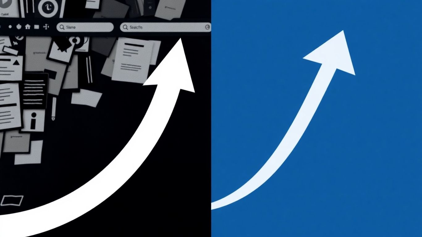
Another common website usability problem is having a design that’s just too busy. When your homepage or any page is packed with too many colours, fonts, or elements competing for attention, it can overwhelm visitors. They won’t know where to look or what to do next. This visual clutter makes it hard for people to find what they’re looking for, and it definitely doesn’t help with sales.
Think about keeping things clean and simple. You want to guide users easily through your site. Here are some things to consider:
- White Space: Use space effectively to make content easier to read and digest.
- Limited Elements: Don’t overload pages with too many different fonts, colours, or graphics.
- Clear Hierarchy: Make it obvious what the most important information or actions are on the page.
When your site looks clean and organised, it creates a better user experience. It shows you’ve thought about how people will use your site, which is a big part of avoiding conversion-killing website flaws and improving user experience design pitfalls.
Navigation And Call-To-Action Errors
When people visit your website, they’re usually looking for something specific. If they can’t find it easily, they’ll probably leave. That’s where your site’s navigation and calls-to-action (CTAs) come in. Getting these details wrong can significantly harm your chances of getting someone to do what you want them to do, such as making a purchase or signing up for a newsletter.
Confusing Site Navigation
Think about how you use websites. You want to click on a menu item and know exactly where it will take you. If your menus are messy, have confusing labels, or don’t make sense, people get lost. It’s like trying to find your way around a city with no street signs. Many sites have this problem, with tons of product categories that overwhelm visitors. You need to make it simple for people to find what they’re looking for.
Here’s how to make your navigation better:
- Organize logically: Group similar items together. If you sell clothes, have separate sections for shirts, pants, shoes, and other items. Don’t just dump everything into one big list.
- Use clear labels: Instead of “Apparel,” maybe use “Men’s Clothing” or “Women’s Shoes.” Be specific.
- Keep it consistent: Your main menu should look and work the same on every page. Don’t move things around randomly.
- Add a search bar: Especially if you have a lot of products, a good search function is a lifesaver. Ensure it suggests relevant options as people type.
Missing Or Unclear Call-To-Action Buttons
Your CTAs, or Call-to-Actions, are the buttons or links that tell people what to do next – such as “Buy Now,” “Sign Up,” or “Learn More.” If these are hard to find, don’t stand out, or don’t clearly say what will happen, people won’t click them. It’s a big mistake to ignore these. Your primary goal is to encourage people to take action, and CTAs are the tools you use to guide them.
To make your CTAs work better:
- Make them visible: Use colours that contrast with the rest of your page. They should pop out. Please don’t make them the same colour as the background or too small.
- Use action words: Tell people exactly what you want them to do. “Get Your Free Guide” is better than “Submit.”
- Place them strategically: Position your CTAs where people can easily see them, ideally without requiring them to scroll too much. If someone has just read about a great product, the “Add to Cart” button should be readily available.
| Feature | Good Practice | Bad Practice |
|---|---|---|
| Visibility | Contrasting color, clear size | Blends in, too small |
| Wording | Action-oriented, specific benefit | Vague, generic |
| Placement | Above the fold, near relevant content | Hidden, requires excessive scrolling |
| Quantity | One primary CTA per section/page, if needed | Too many competing CTAs, overwhelming the user |
Visual And Content Presentation Mistakes
Your website’s look is just as important as the message you send. If visitors don’t like what they see, they’re probably not sticking around—no matter how good your offer is. These mistakes can turn people away fast and stall conversions.
Unappealing Or Generic Images
People notice your images before they ever read a word. Using the same tired stock photos as everyone else or blurry, low-quality pictures makes your site feel lazy. It can even make folks doubt your business is real. You want visuals that actually mean something for your brand, connect to your products, and feel original.
Here’s how to pick better images:
- Skip generic stock photos. Opt for custom shots or, at the very least, stock images that align with your vibe.
- Ensure that the people in your photos appear genuine no forced smiles or cheesy poses.
- Images should load fast but still look sharp. Compress your files, but avoid making them pixelated.
If you’re curious about the impact stock photos vs. authentic images have on trust, check this out:
| Image Type | Likelihood to Build Trust |
|---|---|
| Generic Stock | Low |
| Custom Photography | High |
| Real Customer Pics | Very High |
Overly Busy Homepage
You want folks to find what they need in seconds, not feel overwhelmed. When your site’s home is packed with banners, popups, buttons, moving text, and twenty calls to action, people freeze. They can’t see what’s important, so they leave.
Common signs your homepage is overloaded:
- There are too many links and buttons competing for attention.
- Heavy use of bright colours and different fonts everywhere.
- The lack of space is filled with something.
Tips to clean it up:
- Decide on the one main thing you want your visitor to do (your main call-to-action) and make that the clear focus.
- Limit yourself to a simple colour palette, two fonts max, and just a few images or icons.
- Use white space to give each section room to “breathe.” It makes everything easier to read and feels calmer.
Honestly, sometimes you have to cut out stuff you spent hours working on, but if it’s not helping your customer decide quickly, it’s just getting in their way.
Discussion about this post