Most people are using their phones to access the internet these days. Seriously, look around you – everyone’s got a phone in their hand. Statistics show that well over half of all internet traffic comes from these devices.
That’s a huge chunk of potential customers or readers you might be missing if your website isn’t set up right for phones. It’s not just about checking emails anymore; people are shopping, reading news, and connecting with friends all on their phones. If your site is slow or difficult to use on a small screen, they’re likely to leave and find someone else who makes it easy.
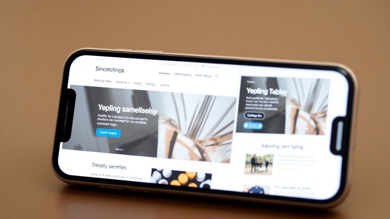
Understanding Mobile-First Design Principles
So, what exactly is this “mobile-first” thing? Essentially, it means that when you build a website, you start by considering how it will look and function on a phone. You figure out the most important things first, the things people absolutely need to see or do. Then, you build up from there for larger screens, such as tablets and computers. It’s like building a house, starting with the essential rooms and then adding more space later. This way, you make sure the core experience is solid, especially for the majority of people who are on their phones. It’s about making sure the basics are done well before worrying about fancy extras on a larger display.
Key Advantages of Mobile-First Design
When you build a website with mobile users in mind from the very start, you get some pretty good perks. It’s not just about keeping up with trends; it’s about making a better product for everyone.
Enhanced User Experience and Conversions
Think about using a website on your phone. If buttons are too small to tap, or text is tiny and hard to read, you probably don’t stick around for long. Mobile-first design fixes this. It means ensuring that things are easy to click with a thumb and that text is readable without requiring zooming in. This focus on making things simple and quick for mobile users means they’re more likely to find what they need and do what you want them to do, whether that’s buying something or signing up for a newsletter. When people have a positive experience, they tend to stick around and return.
- Faster Load Times: Mobile-first development often leads to quicker loading pages because you’re prioritising what’s most important. Less clutter means less to download.
- Easier Navigation: Designing for a smaller screen forces you to organise content logically. This makes it simpler for users to navigate, regardless of the device they’re using.
- Touch-Friendly Controls: Large, clear buttons and links are essential. This makes interacting with the site much less frustrating on a touchscreen.
Improved Search Engine Rankings
Google has made it quite clear: they care a great deal about how your website performs on mobile. In fact, they now use the mobile version of your site for ranking. This means if your mobile site is slow, hard to use, or missing content, your search engine ranking can suffer. By adopting a mobile-first approach, you’re essentially building a website that Google likes better. This can lead to better visibility in search results, which means more people finding your site. It’s a direct link between creating websites that work on all screens and getting found online.
Here’s a quick look at why this matters for search engines:
- Mobile-First Indexing: Google primarily uses the mobile version of your content for indexing and ranking. A good mobile experience is no longer optional.
- User Engagement Signals: Search engines notice when users spend more time on your site and visit more pages. Mobile-first design helps with this by providing a better experience.
- Page Speed: Faster websites rank higher. Mobile-first development naturally pushes for speed and efficiency, which search engines reward.
Navigating the Mobile Landscape
So, you’ve decided to go mobile-first. That’s a smart move, especially with how much people use their phones these days. But how do you ensure your website functions well on those smaller screens? It’s not just about shrinking things down; it’s about rethinking how people interact with your site when they’re on the go. This means adapting websites for different devices isn’t just a nice-to-have; it’s pretty much the main event now.
Prioritising Content for Mobile Screens
Think about it: a phone screen is tiny compared to a computer monitor. You can’t just cram everything in there and expect it to look good or be easy to use. Mobile-first design forces you to get real about what’s most important. What does someone absolutely need to see or do when they land on your page from their phone?
You have to pick the core message, the key products, or the vital information and ensure that it’s front and centre. It’s about cutting out the fluff so users can find what they need without having to scroll endlessly or get lost. This approach helps ensure users grasp the main point quickly, which is beneficial for them and aligns with your site’s goals.
Optimising for Touch-Based Interactions
People don’t use a mouse on their phones, right? They use their fingers. This changes everything. Buttons need to be big enough to tap without accidentally hitting something else. Links should have enough space around them. Forms should be easy to fill out using a virtual keyboard. We’re talking about making sure everything is easy to tap and swipe.
It’s about designing for how people actually use their devices, not how they might use a desktop computer. This focus on touch-based interactions is a big part of optimising user experience on smartphones. It makes the whole experience feel more natural and less frustrating.
Here are a few things to keep in mind for touch controls:
- Button Size: Aim for buttons that are at least 44 x 44 pixels. This gives enough room for a finger tap.
- Spacing: Ensure there’s a slight space between tappable elements, such as links or buttons, to prevent accidental clicks.
- Form Fields: Keep form fields simple and use appropriate keyboard types (like numeric for phone numbers) to make data entry smoother.
Discussion about this post