When a small nonprofit redesigned its donation page, the founder swapped a harsh black background and scattered colors for a warm orange accent, a trustworthy blue for key actions, and clearer contrast, and watched completions rise within two weeks; that quiet win captures the power of color psychology done right.
This guide shows you how to turn uncertainty about “which color works” into a practical system: mapping audience emotions to brand identity, aligning palette choices with UX goals and measurable KPIs, building accessible token-based palettes that scale, applying color with restraint across hierarchy, CTAs, forms, and data, and validating decisions with A/B tests, analytics, and cultural checks.
If you’ve worried about picking the “wrong” hue, confusing users, failing contrast, or seeing conversion dip, you’ll get concrete tables, acceptance criteria, and example rules you can ship, so your colors earn trust, improve readability, and move the metrics that matter.
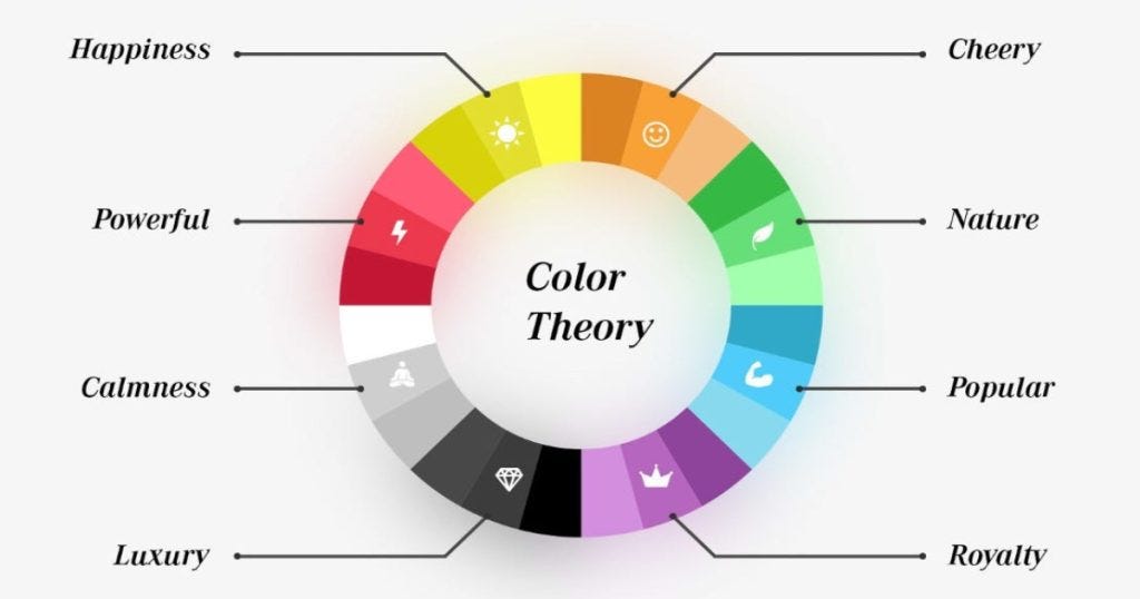
1. Map Audience Emotions to Brand Identity With Strategic Color Choices
Skip the guesswork and map audience emotions straight to your brand identity using strategic color choices that actually influence behavior. Define 2–3 key personas, lock the emotion you want each to feel, then assign a primary hue and tight accent palette to keep your UI consistent and persuasive.
Add one “avoid” rule to prevent visual sabotage, and do a quick cultural color check so you don’t step on landmines in different markets. Keep it simple, intentional, and testable, that’s how you turn color psychology into conversion fuel.
| Persona | Desired Emotion | Primary Hue (HEX) | Accent(s) | Avoid | Cultural Notes |
|---|---|---|---|---|---|
| B2B Buyer | Trust, Clarity | #2563EB (blue) |
#10B981 (green) |
Red near errors | In finance, red implies loss |
| Beauty Shopper | Excitement, Luxury | #8B5CF6 (purple) |
#D97706 (gold) |
Neon greens | Purple = royalty in many regions |
| Nonprofit Donor | Warmth, Hope | #F59E0B (orange) |
#14B8A6 (teal) |
Stark black BGs | Orange = energy; ensure contrast |
For the B2B Buyer, a confident blue (#2563EB) drives credibility and clean decision-making, while a calm green accent signals stability and positive action. For the Beauty Shopper, rich purple (#8B5CF6) with a gold accent screams premium and gives that lush, treat-yourself vibe without feeling tacky.
For the Nonprofit Donor, energizing orange (#F59E0B) paired with supportive teal creates warmth and a sense of optimism that nudges people to help because they feel their impact.
2. Tie Palette Decisions to UX, Readability, and Conversion KPIs
Pick a lane for each screen and commit: is this layout about attention to the CTA, copy comprehension, or trust and reassurance? If it’s attention, crank contrast so the primary CTA owns the stage; if it’s comprehension, dial in neutral grays and high contrast text for readability; if it’s reassurance, use a consistent success color and subtle accent cues to reduce friction.
Define 3–5 conversion KPIs that actually move business outcomes: CTA CTR, form completion rate, time to first click, error rate, bounce rate. Then write acceptance criteria that force accountability, like: “Primary CTA CTR +15% within 14 days at p<0.05.” No vanity metrics, no undefined goals, just clear targets tied to a color system that earns its keep.
Map color roles directly to those KPIs so design choices aren’t vibes, they’re strategy:
- Primary color = main CTA only (boost CTR)
- Success color signals progress and reduces form anxiety (lift completion)
- Neutral palette with strong foreground/background contrast improves readability (cut bounce)
- Alert color reserved for errors (lower error rate)
Lock the measurement setup: analytics event names (cta_click_primary, form_submit_success, error_shown), segments (new vs returning), time window (2 weeks), and hard guardrails (no conversion drop >5%). If the palette fails the numbers, it’s not “creative,” it’s noise, iterate the hue, saturation, and contrast until the data says you nailed it.
3. Build Accessible, High-Contrast Color Palettes That Scale
Here’s the playbook seasoned designers use when they want a palette that actually works in production, not just on mood boards. Start by locking in one brand base hue (the expressive workhorse), one neutral scale (choose cool or warm grays for consistent depth), and 4–6 semantic roles: primary, secondary, success, warning, error, info.
Turn these into design tokens, name them clearly (–color-primary-500, –color-text-900) and never hardcode hex inside components. Then enforce WCAG contrast targets ruthlessly: 4.5:1 for body text, 3:1 for large text and icons, and at least 3:1 for interactive UI elements. Aim for AA compliance as a baseline.
Build depth with two tints and two shades per role, for example, 300, 400, 500, 600, 700, and test against real backgrounds like cards, app bars, and focus states. Don’t rely on color alone for status; pair icons and text labels with success and error states to keep things accessible for color-blind users.
| Role | Token Name | Example HEX | Contrast Target |
|---|---|---|---|
| Primary | –color-primary-500 | #0EA5E9 |
3:1+ on fills, 4.5:1 for text on it |
| Text | –color-text-900 | #111827 |
7:1 on white |
| Success | –color-success-500 | #10B981 |
3:1+ for badges; pair with dark text |
| Error | –color-error-600 | #DC2626 |
Provide icon + text, not color alone |
Scale With Token Ladders
Make it scalable with a tight token ladder and real-world checks. Example: for primary, define:
- –color-primary-300
#7DD3FC(light states) - –color-primary-400
#38BDF8(hover) - –color-primary-500
#0EA5E9(default) - –color-primary-600
#0284C7(pressed) - –color-primary-700
#0369A1(focus ring on light UIs)
For text, keep –color-text-900 #111827 on white for crisp 7:1 contrast, and use –color-text-100 #F3F4F6 on dark backgrounds. Validate critical pairs: #111827 on #FFFFFF (~15:1), #FFFFFF on #0EA5E9 (~4.6:1 body text safe), #111827 on #10B981 (~7:1). Wire up tokens in CSS variables or design systems and you’ll ship interfaces that look sharp, pass accessibility checks, and scale without color chaos.
4. Apply Color to UI Components, Content Hierarchy, and States
Hierarchy lives or dies on restraint: let headlines win with size and weight, keep body text neutral for effortless reading, and make links unmistakable with a distinct, accessible blue and an underline that doesn’t disappear. For CTAs, commit to one primary action color per page and keep the secondary styled as outlined or toned down, so the eye doesn’t bounce around.
Nail interactive states with clarity: hover shouldn’t just be a pale wash, add a border, bump underline thickness, or adjust contrast so hover/active/focus are obvious and compliant. In forms and feedback, never rely on color alone; pair a red error with an icon and a crisp message, and use a success badge that reads at a glance. For data visualization, stick to colorblind-safe palettes, reserve saturated hues for the series that matter, and keep supporting data in muted tones for instant visual priority.
Drop-In Rule Set That Works
- Primary CTA:
#0EA5E9with white text; hover#0284C7; focus ring 2px#0EA5E9 - Links:
#2563EBunderlined; on hover, underline gets thicker for tactile feedback - Error:
#DC2626text plus an error icon and a clear message - Success:
#10B981badge with dark text for contrast
This approach aligns content hierarchy, accessibility, and conversion-focused UI design without visual noise. Use color as a signal, not decoration; keep one clear primary action; pair color with iconography and copy; and make every state unmistakable for faster decisions and better usability.
5. Validate Color Decisions With A/B Tests, Analytics, and Cultural Checks
Start ruthlessly practical: run pre-checks before anything hits production. Confirm contrast AA/AAA compliance for core text and CTA buttons (aim 4.5:1 for body, 3:1 for large text), run a color-blind simulation (Deuteranopia/Protanopia/Tritanopia), and define dark-mode mapping using design tokens that flip neutrals without muting your brand hue.
If your primary CTA color is electric blue, lock its role token and tune only saturation/brightness across modes so it remains recognizable. Then test one change at a time, no Frankenstein variants. Write a sharp hypothesis and tie it to a measurable KPI with a clear stopping rule. Segment results by device, traffic source, and locale, and actively hunt for segment reversals, desktop winning while mobile tanks means your color psychology is colliding with context (glare, thumb reach, OLED contrast).
Close with a cultural review: color meanings swing hard by market; document exceptions and adjust hues, not just hex values, to respect local semantics while preserving brand consistency.
A/B Testing Framework
| Variant | Primary CTA Color | Hex | Hypothesis | KPI | Audience Segment | Result (CTR) | Stopping Rule |
|---|---|---|---|---|---|---|---|
| A (Control) | Sky Blue | #0EA5E9 |
Baseline performance | CTR | Mobile | US | Paid Social | 3.2% | 14 days or 95% confidence |
| B (Test) | Teal | #14B8A6 |
Calmer tone increases click intent | CTR | Mobile | US | Paid Social | 3.6% (+12.5%) | Same |
| B (Locale Check) | Teal | #14B8A6 |
Teal boosts trust in JP checkout | Checkout Conversion | Desktop | JP | Organic | −3.1% (conflict with banking green) | Stop at −2% or p<.05 |
| C (Cultural Adapt) | Royal Blue | #2563EB |
Shift away from banking associations | Checkout Conversion | Desktop | JP | Organic | +4.4% | 10 days or 95% confidence |
Testing Workflow
Keep the workflow tight:
- Pre-checks: contrast, color-blind, dark-mode tokens
- One-variable A/B with a precise statement: “Switching primary CTA to teal will increase CTR by 10% for mobile new users”
- Segment reads and flag reversals early
- Cultural review per locale; if meanings clash, adapt hue and document the exception in your design system
- Ship the winner, update design tokens, attach before/after screenshots, metrics, date, and owner in a decision log
It’s color psychology with receipts: measurable, culturally aware, and baked into your system, not vibes-based design roulette.
Discussion about this post